It almost seemed like a PR stunt.
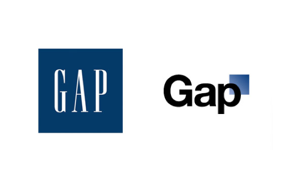
When the Gap replaced its iconic logo with a new visual identity, Gap-watchers were not just alienated. They seemed to take it personally. It was as if a fortyish suburban dad suddenly hired a downtown stylist. Branding experts decried the Helvetica font with its tech-y box as “lazy,” and fashion bloggers rejected it faster than you can say “mom jeans.”
Out of the box, into the fray?
By freeing its logo from the classic blue square in favor of plain black letters edged by a tiny blue box, the Gap seemed to be trying to think out of the box, literally. I can understand the thinking, and the impetus around the rebranding, since the brand has clearly struggled to redefine itself and update its classic style.
But, the new identity is a severe break from the one we’ve looked at for 40 years. The reason for the change wasn’t fully communicated in advance, and the initial explanation wasn’t well articulated. Not only did the media and brandosphere resent the new look, the major social networking platforms lit up with customer backlash. Commenters compared the redesign to financial or pharmaceutical logos. One said the new Gap suggested “General Accounting Principles.” It just wasn’t a fit.
Faced with a social media firestorm, Gap did the best possible thing. It thanked commenters for their “passion” around the brand and announced it would consider new logo suggestions from the crowd. Now that it has our attention, we can look forward to the possibility of a virtual fashion parade of new visual identities for the brand.
PR gimmick? Social media experiment? Gap says no, and I seriously doubt it. Like other venerable brands who’ve faced customer resistance to change (remember the outpouring over Tropicana’s new package?) it faces a very expensive retrenchment.
Making the brand relevant again
But in my view, it’s not terrible that, after years in the doldrums, people are talking about the brand and its look. The only problem is, crowdsourcing a new logo for a 30-year-old classic may be good PR (or crisis management), but it’s probably not the best way to redesign a brand.
Where does Gap go from here? It will do well to continue to acknowledge the feelings of the public, using it as the basis for a higher level of social media engagement. But it should resist the urge to crowdsource an entirely new logo, which has the entire branding community up in arms, and looks like backpedaling. Its best move is to analyze the feedback, then incorporate the best of it in a modified visual identity created by a team of professionals, and explained through paid media, earned media, and the social Web.
New logos are risky, and they never please everyone, but Gap now has a rare opportunity to focus on how customers really connect with the brand…and to avoid the communications gap that no business can afford during a time of change.
Update: On October 12, Gap announced it will scrap the new logo and revert to the old Gap identity, though we can expect to see a red version for the holidays. Nice.

