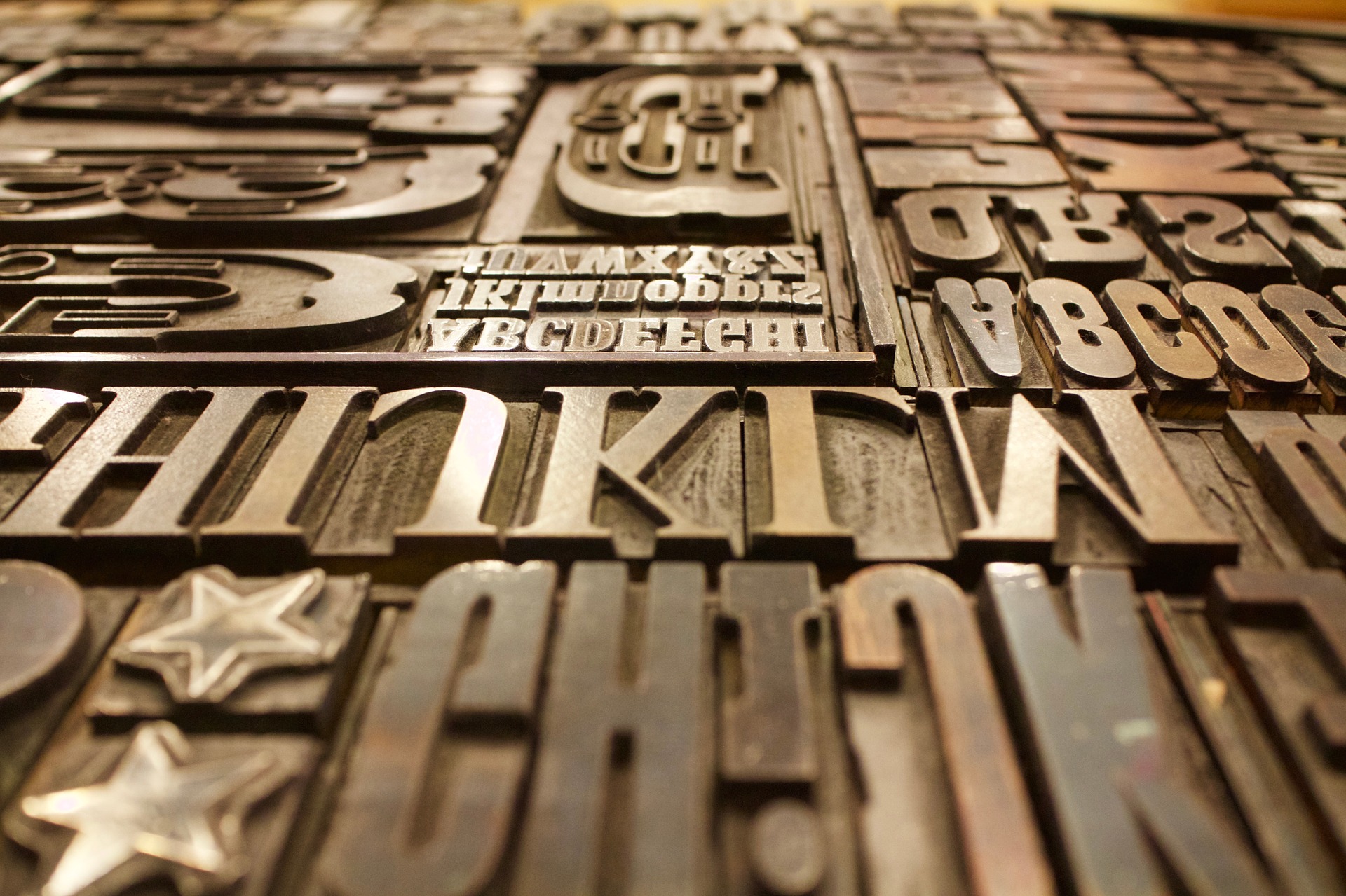

Every year the graphic design world is treated to a variety of new fonts – the good, the bad and the ugly. Because we PR types are always looking for ways to make correspondence stand out, we checked out some of this year’s contenders. They include some pretty out-there fonts, with names like Bleeding Cowboys, Ransom Note and Aristotle Maple Hero.
These may not be up to par for business correspondence but your choice of typeface does say something about your character, your personality and your attitude, according to researchers at Wichita State University.
Here is a primer on a few popular font types and what they say about their users.
Serif Fonts are those with rounded edges on the letters or extra strokes added to the top and bottom of each character. Common examples include Antiqua and Garamond as well as Times New Roman. The researchers found that TNR projects stability, politeness, practicality and formality. It is recommended for business correspondence, but personally, I find it boring, utterly lacking character and really dated.
Courier New is also a serif, and study respondents found it rigid, sad, dull and unattractive. I can’t imagine using it for much!
Sans Serif fonts are typefaces sans embellishment and include many of those commonly associated with business writing – the aforementioned Arial and Verdana, which are also considered to be stable and conformist, but authoritative and persuasive.
Scripted/fun fonts such as Comic Sans are just what they sound like – fun and informal. They say creative, happy and attractive.
As you might imagine, the pundits come down on the side of “stable and conformist” for most business writing.
So, even though you’re an Arial on the outside, do you have a wild “inner” Bleeding Cowboys or Jokerman just screaming to get out?